Monday, 17 May 2010

Finding the right texture - Grenade


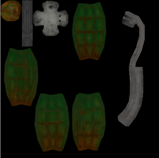
As of now, i have been texuring my grenade the most as it was the first object i unwrapped. So looking back to my story for the grenade, i was trying to pick out parts i could add into the texture to give it some backstory from just looking at it.

As it had meant to have been in a case for the past 2 years, i wanted to make it show that it was old looking and had probably seen better days. To do this i was going to add mud marks, scratches, dust and dark dirty paint. Once i had the grenade unwrapped and the cluster on photoshop, i started to select certain areas in different layers to edit them separately. I did this using the pen tool and selecting points around the parts of the grenade I wanted to edit separately, which was each side of the grenade including the bottom, and then all the parts of the tag. Now that all parts of the grenade were split into different layers, i could start texturing and editing.

I chose a dark green for the initial grenade colour and then started to use different brushes as well as adding effects to get a better looking texture. I started using very light strokes of gray over the grenade to give it a dusty and mucky feel by lowering the opacity and then raised the opacity again to add mud to the grenade, This time changing the brush colour to different shades of brown and slowly painting on the effect.

Friday, 30 April 2010

Blog 4 - Texturing the Monitor

Today we finished texturing the front of the monitor and learnt some new techniques that should really help when texturing our objects later on.
Coming back from last time we worked on the monitor when we only had the Base and Alpha maps completed, to now creating two more groups to complete the texture fully and these were Specular and Normal.

The specular map was easy to do as all you do at first is duplicate the Base group. From here i just had to lighten or darken parts of the monitor that would be lighter or darker, from example the little LED light i made pure white as well as the monitor screen, but the rim and edge of the monitor were more of a darker gray colour.
Though this isnt the only thing a specular map does, it reflects light and can make objects look shiney, but if its used right, can make some objects look very realistic and more legit. Like to make an object look as though its made of gold, it should be coloured in a brownish orange and the specularity should be a bright yellow to make it seem more legit.

Next was the normal map which was even easier to do than the specular map, though this was mostly down to the fact that it was an easy object to create a normal map for, and much like the specular map, i started by duplicating the Base group. Because a normal map's job is to capture the look of depth on a texture using different shades of black and white, my monitor didnt have much to offer so i was left with creating my logo coming out of the monitor and the LED button going inwards into the monitor.
As i said before, a normal map uses different tones of black and white to create a depth look, with white being a high look, black being a low look and grey being neutral. So keeping this in mind, i drew around my logo in white, the button in black and everything else like the screen for example was coloured a medium tone of gray to keep it inbetween.

Blog 3 - Torch

Torch

The torch's story comes from 3 teenagers that thought it would be a good idea to raid an old abandond house for fun. It was late and the house was pitch black, but they had the torch to guide them so it seemed fine. Though as they opened one of the doors, a rat came running out and the teenager holding the torch dropped it, cracking the glass and scratching the bottom slightly. Through the rest of the night, the torch was dropped a couple more times, scrathing the torch all around, aswell as mucking it up with the dust that had been gatherd.

Textures

This is an exmaple of how i want the main part of my texture to look like, with some added effects such as dust and scratches to give more realism to it.


This is an example of the grip that will be used on my torch and though it isnt much different from the normal texture, i will make it slightly different to make it obvious enough that this part of the model is supposed to be different.
Noteable Parts

Scratches all round the torch.

A large crack on the glass from being dropped too high.

Dust has been picked up from when it was dropped and can be seen well as the torch is primerily pure black.

Blog 2 - Grenade

Grenade

My grenades story is that it was a standerd frag grenade, made in bulck for world war 2. It was a grenade made for the allies and was meant to be used very early on in one of the many battles, but was never used. Instead it had been carried around in an ammunition crate for all of the last 2 years of the war and even when the crate had been open it was still never picked up. Over the 2 years, the grenade had seen a lot of damage, from being moved from place to place, being nuged by other weaponry and mud to name some things.

As it was used for the allies, made at the begining of the war and never used, the look is specific to when it would have been made so the picture above shows a timeline of different grenade shells that were used and as my grenade is supposed to be very old and made at the begining of the war, i will be using the first grenade that is on the picture which is what i wanted to have it like anyway.


This picture gives a rough idea of what i want my grenade to look like, apart from the colour. It even shows the tag missing which is another part i will have in my grenade model, though the shape of mine may be slightly tweaked to make it bigger.

Noteable Parts

Mud Splatters
Scratches across the casing
The pin has been reomved but was not set off for some reason, most likely faulty.
The colour from the grenade is slowly degrading in some parts.

Friday, 23 April 2010

Blog 1 - Making A Story For Objects

Last week we started to briefly talk about creating a story for our objects that we will be texturing, and this week we have been given the task of bloggin on what we have come up with so far.
I chose my 3 objects as a space ship, a grenade and an ammunition crate. Each having a completely different story, explaining damage, apperance and use.


Space Ship
The story behind my ship is that it has been mass produced by Sarians to fight against their enemies, the Marps. Sarians are fighting for the planet earth's safety as the Marps are trying to take over us.
This space ship isn't particularly special in any way other than it has lasted much longer in battle than most of the space ships than came along with it, which explains most of the large dints, scratches, paint wearing and damage over all. The ship is mostly painted gray with lines of orange as these are the two colours of the sarians flag and suits. Also each wing shows the model number of the ship though these seem to have waired slightly over time.

Noteable parts

Battle scars/scratches, Dints,
Silver with Orange stripes, warred out paint
Huge turbines – darker as it gets to the centre,
Symbol showing what side it’s for (if it’s in a war)
Mostly old dirty glass and one newer glass panel which has been replaced because it was broken in a fight.

This picture shows a good idea of how i want my ship to look other than the paint obviously. Much sleeker and smoother than the picture above which is much bulkier.